3d surface plots of GDP vs. event data
Tags:
#Visualization
A while ago I wrote a post about how the patterns by which data for cross-national datasets observed over multiple periods, e.g. with country-year or country-month observations, vary is important for modeling and prediction. Here is another way to visualize why this is the case using 3-d surface plots made with Plotly.
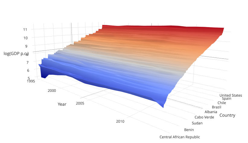
The plot shows logged GDP per capita for >150 countries from 1995 to 2013. This is about the time period we cover in our data for forecasting irregular leadership changes. Countries are sorted by GDP for the last year with data, which is why the near edge of the plot is smoother than the far end. It’s obvious that there are some changes within countries and at rates that differ from other countries, but still most of the variation is between countries.
The differences are much larger at the high end when we look at the raw, unlogged GDP data:
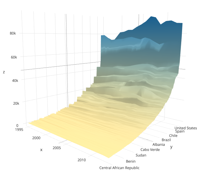
Yes, there are differences within countries and this is clearer to see with the unlogged data, but overall the surface is pretty flat over the time dimension and sloping or curving over the list of countries on the y dimension.
The reason why variation on one (spatial) or the other (temporal) dimension is important, as I argued in the other post, is that to predict dynamic outcomes like civil war onset, or irregular leadership changes in our case, temporally varying variables are absolutely necessary. Not sufficient by default, but neccessary. Data like GDP, similar structural indicators, and more generally time-invariant or largely invariant variables cannot possibly predict the timing of events.
Now compare the two plots above to what anti-government protests look like:
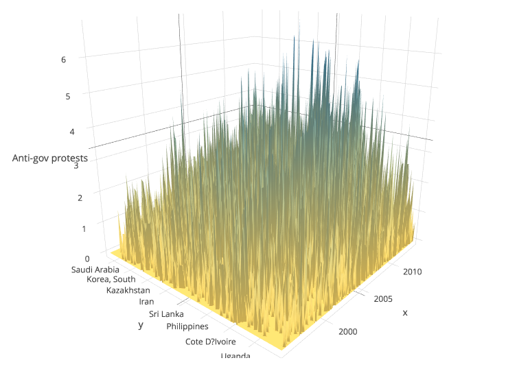
That’s essentially the same set of countries, and over the same time period, but using monthly rather than annual observations. I also flipped the x and y axes, but that hardly matters, it’s spiky either way. The data come from the replication data for the Research & Politics article I linked above, and consist of counts of anti-government protests events in the ICEWS event data. There is more variation over time, and although there are countries with higher mean levels of protests, it’s not as pronounced a pattern as it was with GDP. This is the kind of thing that might help pin the timing of events down.
No discussion of event data should probably fail to mention that media-based event data are subject to important biases and irregularities, and that these are crucial for attempts at causal inference. They are not fundamentally a threat to use in prediction sans explanation though.
Creating the plots was pretty easy. There is a plotly R library that allows you to send ggplot2 objects to their website, where a bit of clicking and rotating will turn them into interactive 3-d surface plots. Although it seems to not handle missing and ragged–think countries entering at various points in the 60’s or 90’s–data very well, it’s a bit more intuitive than looking at summary means and variances, which in any case might obscure differences like these in the kind of structured data commonly used in IR (country/province/grid cell–year/month)
Replication code (3d-var-viz).
Interactive plots: