Data management and missing data
Tags:
One of my first assignments as a research assistant in graduate school was to create and work with a directed dyadic refugees and migration dataset. This was in about 2006. The data were big-ish, maybe a 100 MB in some incarnation, so my advisor gave me a CD and probably some sensible instructions on what I was supposed to do. Off I went to the grad computer lab, since I didn’t own a laptop then. I had basically no experience with handling data, nor did I really know how to use Stata, which, bless Stata, will let you do lots of weird things without necessarily giving an indication that something is wrong. So I would sit in the grad computer lab, hack away at the data, and periodically burn the results to a CD that I would share at the end of the day with my advisor. He invariably found one problem or another with the data. It was a painful, messy experience.
I was clueless. My advisor would find problems or inconsistencies at the surface that were a symptom of deeper issues in how I was manipulating and merging data. Slowly (very slowly) I started recognizing some of the common things to look out for.
It’s been about 10 year since then. But among the things others have found in data wrangling code I have written or I in theirs in the recent past are gems like these:
- An inverse distance spatial lag that didn’t have the inverted part. So things further away had higher weights.
- In a model of binary (0 or 1) outcomes, a counter of previous positive outcomes that immediately updated when a new event occurred, and which when corrected to update the time period after the event happened, wiped out the key result.
- Lagged variables that were not actually lagged anymore.
- Yearly variables that were lagged 1 month, not 1 year.
It’s not really surprising that other people will find problems I overlooked and vice versa, but it probably doesn’t happen that often in political science or at least international relations that people will dig into individual data points. I occasionally look at the data for published studies on coups and other events that we are forecasting in search of models to add, and in the spirit of data management issues, here is my journey through one of these projects.
The data I was looking at consist of country-years and the key variable is civil war onset. I don’t want to mention what paper they came from, because that’s not really important. For what it’s worth, I think the authors built on other people’s data and the paper itself was interesting to me. Also, I was able to replicate the results in the paper without any problems, so that’s a win.
Here is what the data look like, leaving off columns that are not needed for the examples below.
| year | cowcode | ln_gdpen |
|---|---|---|
| 1945 | 700 | 0.85 |
| 1946 | 700 | -1.64 |
| 1947 | 700 | -1.63 |
| 1948 | 700 | -1.64 |
| 1949 | 700 | -1.40 |
| 1950 | 700 | -1.67 |
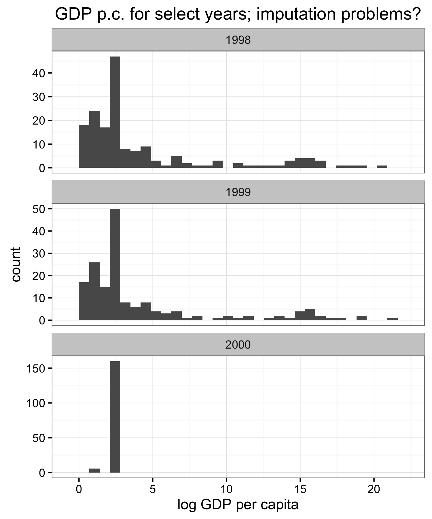
For unrelated reasons I was particularly interested in data for the most recent year in the data–2000–and looked at GDP per capita to use as an example variable. I don’t remember what the initial warning sign was that something is weird, but the GDP data seemed suspicious so I plotted a couple of histograms for different years.
Clearly something weird happens in 2000. GDP per capita doesn’t change that much over time, as you can see from the similarity of the 1998 and 1999 distributions, so something else happened with the 2000 data.
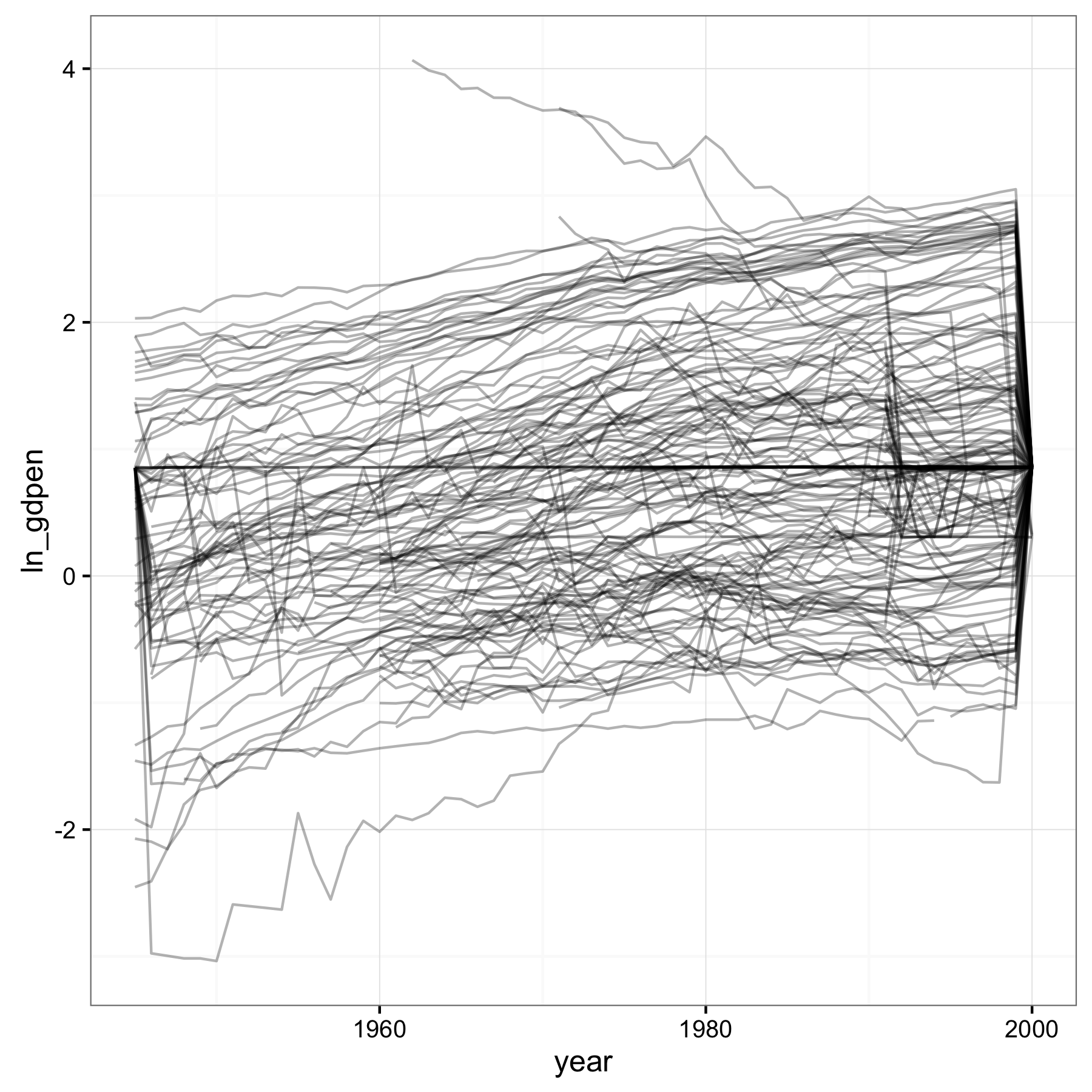
Looking at the series of GDP per capita over years for a few countries led me to just plot all of them.
GDP per capita data should not look like this. There are some spikes, like circa 1950 in the bottommost series that are borderline suspect, but the obvious bigger problem is what’s going on at the beginning and end. This looks like missing values that were set to the mean of the non-missing data. The paper itself doesn’t mention whether and how missing values in the data were imputed.
Plotting missing values
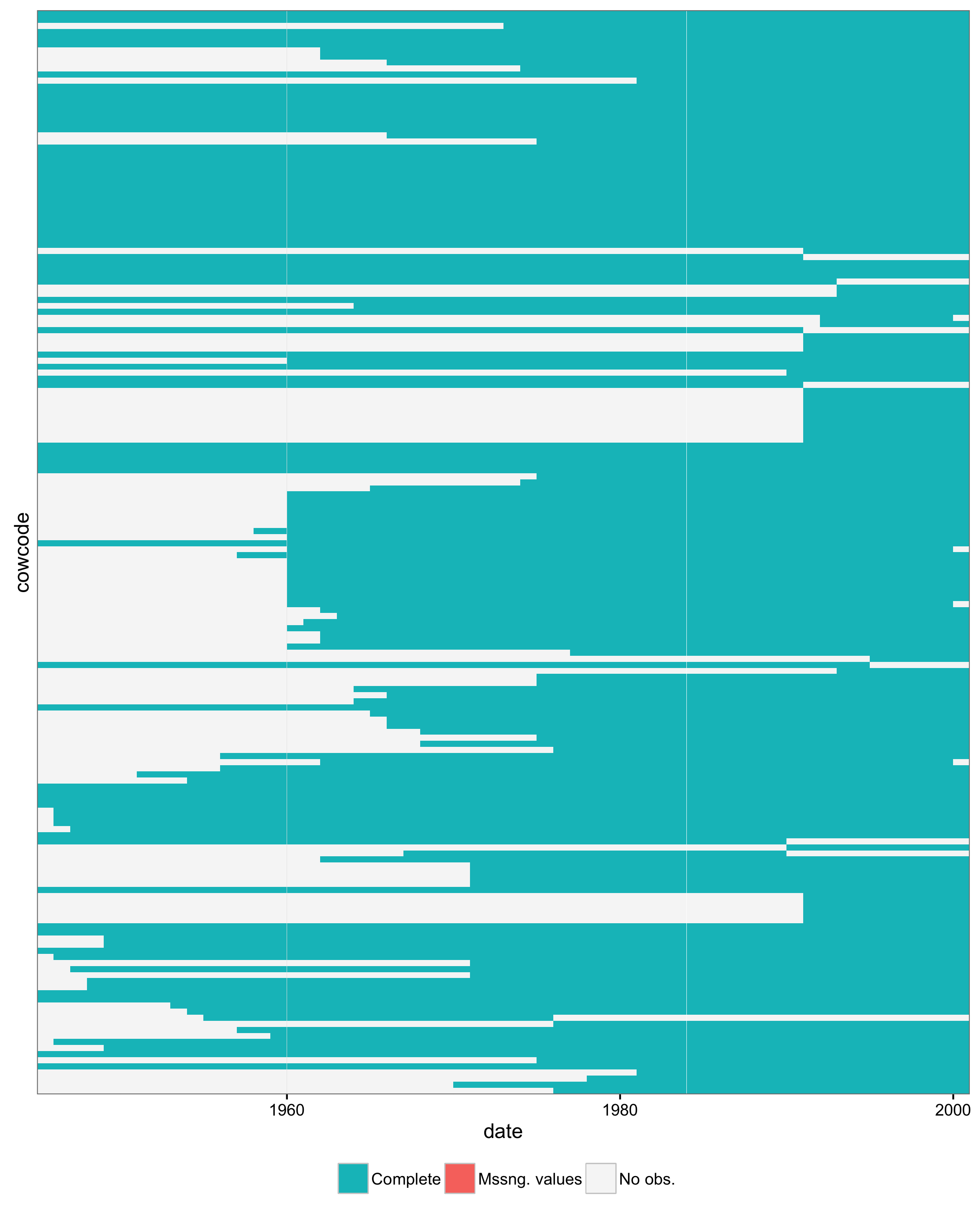
One of the things I usually do with data like these and variables that have missing values is to plot the missing values against country and year. This produces a plot like this:
Each little block in this plot corresponds to a country-year, i.e. a row in the dataset. On the x-axis are years, and on the y-axis all the different countries. The color of each block shows whether that country-year had complete data (blue), missing values (red), or whether the observation was absent entirely. What that means is that given the set of unique countries in the dataset and the range of years, the hypothetical combination of that particular country-year value was not in the data. Like Yugoslavia after 1991, when the country didn’t exist anymore.
There are no missing values in the coup dataset, but four countries drop out of the data suddenly in 2000 (the four white blocks on the right edge). I didn’t label the country axis because it gets cluttered, but the countries are Algeria, Macedonia, Sierra Leone, and Congo-DRC). No obvious reason that these four should suddenly have missing data for GDP per capita, especially since the other values for 2000 appear to have been imputed by setting to the mean.
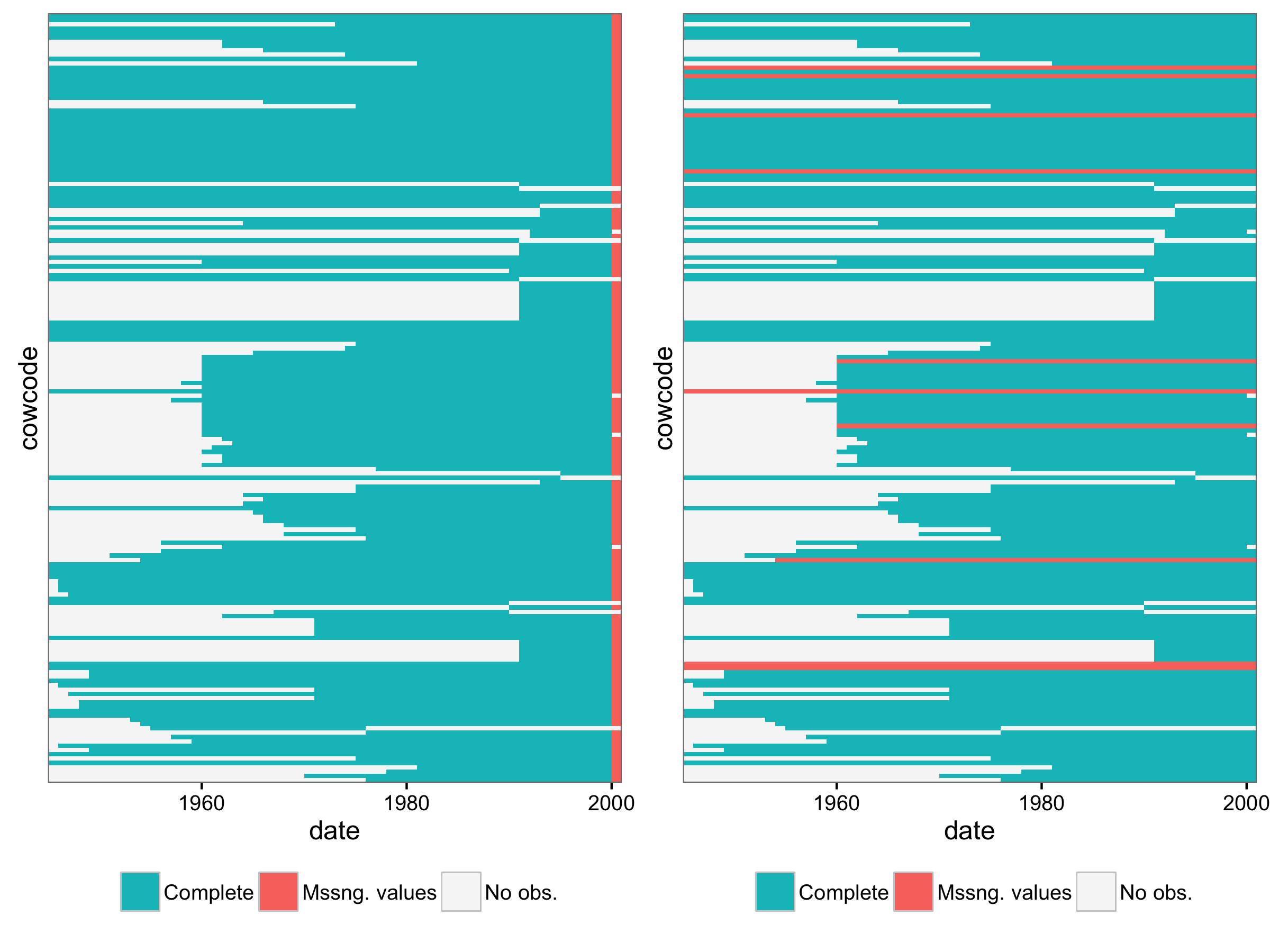
A more usual reason to use these plots is that they can show whether missing values are missing for entire countries or years. That is potentially important for how and whether to impute or drop data. Here are two examples that show what an entire missing year or countries that are completely missing some value would look like.
In between the noodle plot from above and these missing value plots, it would have been more obvious that GDP per capita was missing for a whole year, and that some other way to impute, even by carrying forward the 1999 value, would have been more sensible than setting to the mean.
What about state system membership?
Since the data were fully imputed, looking at missing values doesn’t get us very far. We can also check against state system membership though. The Correlates of War (COW) Project and Gleditsch and Ward have two related, but different, lists of what states were in existence over what time periods. This tells us which hypothetical country-year combinations we should expect, and which should be absent.
Throwing state system membership in the mix gives us two dimensions along which one can classify the observations in the country-year coup dataset. The first dimension is whether a case, by which a mean a particular country-year combination out of all possible combinations, has missing values, is complete, or is absent from the data. Absent here, again, means there is no observation with that country-year combination in the data. The second dimension is whether a particular case was in the state system according to one of the two lists I mentioned before. That makes for six possible combinations:
| Case | In state sys. | Outside state sys. |
|---|---|---|
| Complete case | Good | Bad |
| Missing values | Semi-bad | Bad |
| Case missing | Bad | Good |
In the end, we want all observations in our data to correspond with state system members and to have complete data. Conversely, if we militantly stick to the state system membership lists, we want no cases that should not be there according to the state system lists. Anything else is problematic. For country-year combinations that were in the state system and are missing values for one or more variables, we we may be able to impute. But cases that are missing even though we should have them in the data, like those four countries from before, and cases that are in the data even though they don’t correspond to independent states, indicate that the data do not match the state system membership expectations.
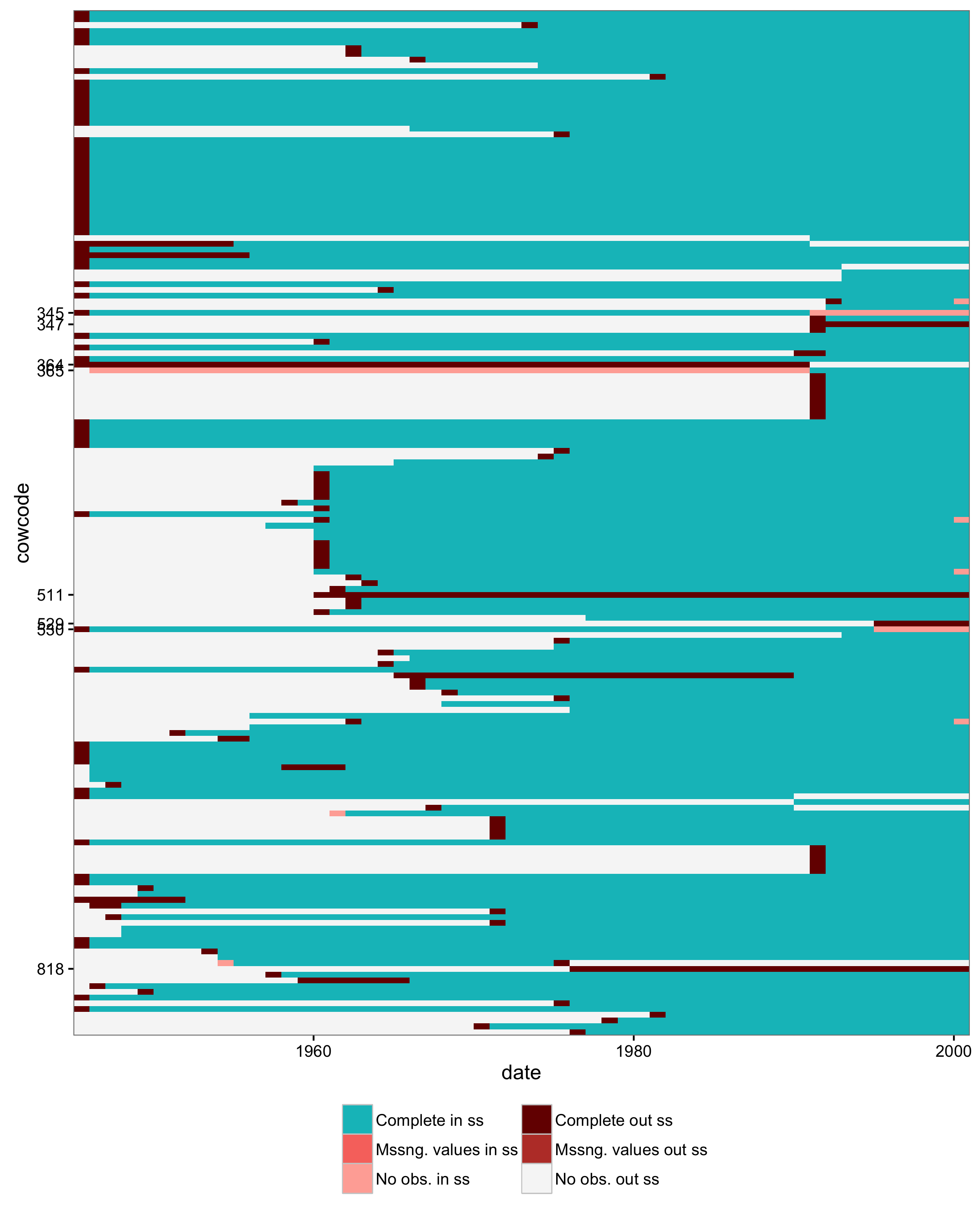
With this new categorization, here is a plot that checks both missing values and state system membership. The legend corresponds to the table above, although the color scheme could use some help.
A couple of things about the data that stand out now, in this plot:
- Most countries have one leading year of data that shouldn’t be there. Maybe this was done so that lagged variables would not be missing for the first year. Twenty-nine countries do not have a leading year of data however.
- Several countries conversely are missing their first year.
- A couple of country codes are mixed up: the Russian Federation and the USSR, also Yugoslavia and Kosovo.
- Why is Zanzibar (511) in the data?
- What is 818? It’s neither in COW nor G&W. Maybe Vietnam, after reunification in 1975? If so, why is North Vietnam (816) also still there, with non-missing GDP per capita values?
- It is easier to see now that the four countries absent from the data in 2010 are a problem. They should be there.
Is this important?
The fact that the data don’t match state system membership, or that there are missing values with strange patterns, is not necessarily bad. There may be reasonable explanation for what happened. But this is also the kind of stuff one might see if there were problems and unintentional mistakes in the process of merging and aggregating different raw datasets to produce the final data that were used for analysis.
These kinds of problems are more obvious when you are doing prediction, as I have been over the past few years. Four countries drop out of the data in the last available year? That’s going to be pretty obvious when your list of forecasts is suddenly shorter than it should be. And it’s easier for data validity problems to be exposed when people ask you to dig into what factors are driving a particular high forecast, or a drastic change in the forecast for a country like Yemen.
One could argue though that it is less problematic for analyses that in the end boil down to a coefficient in a table somewhere. So what if a few values are off? Just like changing a few data points when you are computing the mean of several thousand numbers probably won’t affect the mean too much, a few extra, some missing country-years and a couple of skewed data points in some unknown fraction of cases won’t affect results in important ways.
But then, on the other hand, a few small mistakes will alter results and conclusions sometimes, and we don’t know which of these two worlds we are in with any particular instance of data. I think I can partly piggyback here on the justifications people give for why imputing missing values is important and better than alternatives like dropping cases. Also, estimates are fragile enough that it is common to see robustness checks in published papers. If small changes in specification or measurement are a serious enough threat to need to check for them, then I imagine a small percentage of questionable data points would also be problematic.
If nothing else, i.e. you don’t buy any of that, the plots I’ve shown can help identify issues in the data wrangling and merging stage of a project, and help with decisions about how to handle missing values. Are you comfortable imputing values for GDP per capita for all of 2000? Or for a country that is missing the whole series? Whether you are or not (I’m not), that’s a more focused issue than “hey, 5% of my cases have missing values for this variable, that’s not that much, I’ll just…”.
My solution to these issues has been to start with an empty dataset that contains the cases I know should be there, merge other raw data onto it, and pedantically investigate any deviations and deal with them as seems reasonable. So, start with an empty country-year/month/whatever dataset constructed from one of the state system membership lists, merge, and subsequently impute, drop, or find alternative data sources as needed. It’s tedious, and I probably make a lot of mistakes, but it’s also easier to identify why something is missing and whether that is problematic. Conversely, it drives me nuts when suddenly 10 or 20% of cases used in some descriptive statistics in a paper are suddenly not used in a regression model that is presented in the results, or when the number of cases changes between different models. What is happening here?
