A quick look at the public ICEWS data
Tags:
#Event Data
#Icews
The ICEWS data, including the underlying raw event data as well as some aggregations, were quietly posted on Dataverse the Friday before last. I’ve worked with the ICEWS data for several years now, first when I was working on on the ICEWS package–we deliver updated monthly forecasts for the ICEWS events of interest (EOIs) once a month–and more recently for the [irregular leadership change forecasting project](http://andybeger.com/2014/05/23/the-thailand-coup-and-some-recent- forecasting-work/). The public data are formatted differently from the data I’ve worked with, so most of the code I have lying around is not that useful, but in going through the public data I did recreate a short overview that is nowhere near as complete as David Masad’s first look (using Python), and some code that might be useful for getting started in R.
One of the nice things about the public release of these data, aside from the hope that they will start to [get used in modeling](http://predictiveheuristics.com/2014/10/06/the-right-kind-of- variance/) ([repost](http://andybeger.com/2014/10/06/the-right-kind-of- variance/)), is that it is very interesting to read new takes by people whose perspectives are different than mine, like, so far:
- Overview and descriptives by David Masad
- Jay Ulfelder’s notes on using ICEWS in country-month modeling, including some starter R code.
- Phil Schrodt’s comments on the public release, from an event data producer’s perspective.
Now to the quick overview, using R rather than Python (link to code at end). The first figure below shows the daily event totals, as well as a 30-day moving average. The daily totals increase from around 500 in 1996 to a steady level of around 3,000 from 2005 on, before decreasing again around 2009/2010. As others have pointed out, this stability is a good feature to have since it makes it plausible to model without some kind of normalization to account for changes in the underlying event volume. This is in contrast to GDELT, where the story corpus and event counts increase dramatically over time.
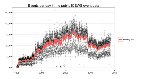
The plot shows the daily event totals as points rather than with a line plot
mainly because I also wanted to add a moving average to bring out the
underlying trend more clearly. This shows an interesting pattern that I didn’t
see with a line plot, namely that the daily event totals seem to be bimodal.
There appear to be two kinds of days: those with relatively few events, about
1,500 during the 2000’s, those with more events, with 2,500 to 3,000 events
per day, and few days that fall in between. I have no idea why that is,
but for that matter also no idea whether this shows up with any other machine-
coded event data. It turns out that on weekends there are only about
half the amount of stories, and hence events, compared to weekdays (thanks to
the ICEWS team for clarifying
this). Talk about a
reminder of how important media bias and coverage are for event data.
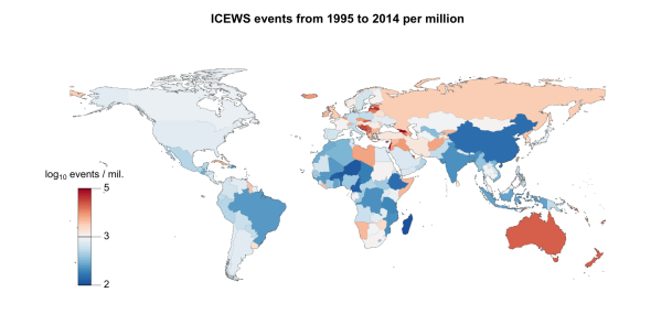
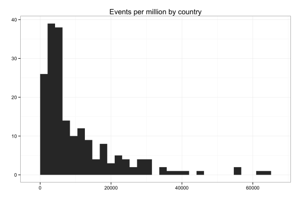
The second plot maps events per capita by country, using the full range of the data from 1995 to 2014. I used 2013 population data from the World Bank World Development Indicators (WDI) to scale the event totals with. Bluish colors indicate below average events per capita, and red higher than average events per capita. The raw rates range from 600 on the low end, with countries like Madagascar, Niger, and Cameroon, and up to 64,000 on the high end for Georgia, Israel, Cyprus, and Lebanon. The rates are very skewed, and note that the map shows log10 of the rate.
I also did some hasty linear regressions models (see the linked code below) of the logged country totals using a couple of variables from WDI. The moments where you can use linear regression in conflict research are rare and so refreshing, I couldn’t resist. Population and GDP both have a positive impact on event totals, and a model with only those two variables has an adjusted R2 of about 0.8. That’s good. Neither area nor broadband internet subscribers nor cell subscribers had significant coefficients and they did not help model fit. Cases like Israel and Georgia have large residuals, so maybe adding some kind of conflict indicator would help. But I think this is starting to touch on the much larger issue of media coverage and bias (again), so I’ll just leave with this:
Code
R code to:
- Summarize the data, including the images in this post.
- Load event data to SQLite, with some example queries.