Precision-recall curves
Tags:
Update 2016-06: there’s a PDF of this now, at http://ssrn.com/abstract=2765419
ROC curves are a fairly standard way to evaluate model fit with binary outcomes, like (civil) war onset. I would be willing to bet that most if not all quantitative political scientists know what they are and how to construct one. Unlike simpler fit statistics like accuracy or percentage reduction in error (PRE), they do not depend on the particular threshold value used to divide probabilistic predictions into binary predictions, and thus give a better sense of the tradeoff between true and false positives inherent in any probabilistic model. The area under a ROC curve (AUC) can summarize a model’s performance and has the somewhat intuitive alternative interpretation of representing the probability that a randomly picked positive outcome case will have been ranked higher by the model than a randomly picked negative outcome case. What I didn’t realize until more recently though is that ROC curves are a misleading indication of model performance with kind of sparse data that happens to be the norm in conflict research.
To recap, the basic situation is that we have a binary outcome, but a stream of predictions that as probabilities range between 0 and 1, and the challenge is how to map this onto the binary outcomes. We could calculate Brier scores and avoid the problem, or we could choose a particular threshold and calculate things like accuracy, percentage reduction in error, etc. These measures rely on how positive predictions match up with observed outcomes (see the confusion table above), but the drawback is that they depend on a particular threshold value, and will change as the threshold changes. A way around this is to record and plot all possible combinations over the range of possible threshold values, and this is essentially what ROC curves are.
To construct a ROC curve, you would pick all possible thresholds, bin predictions to 0 or 1, and then calculate the true positive rate and false positive rate associated with each threshold, giving you the data you would need to plot the ROC curve. The true and false positive rates are calculated as the ratio of true positives (cases the model got right) to overall positives in the data, and the ratio of false positives (cases the model predicted 1, but that did not have a positive outcome) to overall negatives in the data. Here’s an example using some simulated data I’ll discuss more below:
Which gives the following ROC curve if we plot the TP and FP rates:
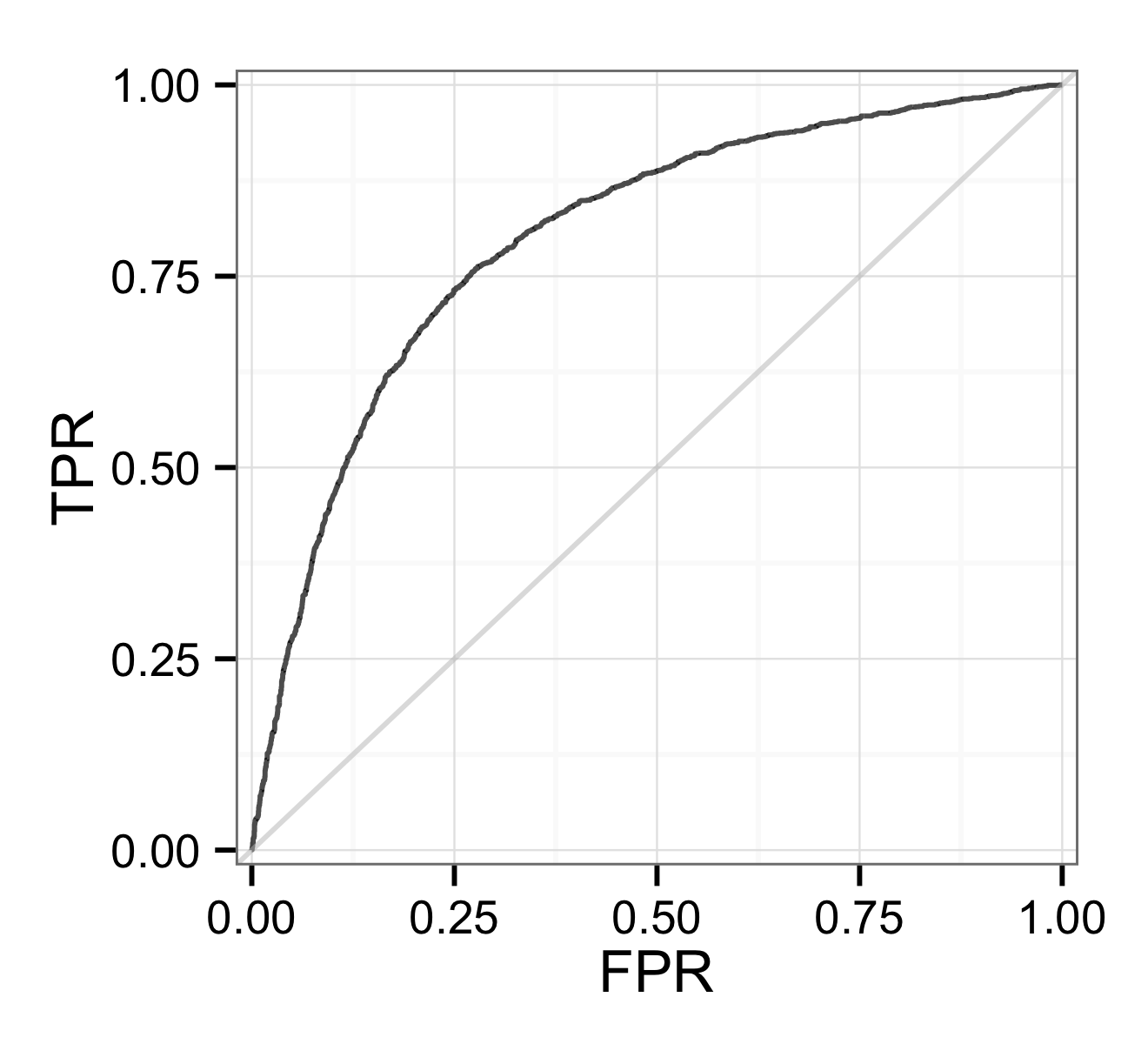
ROC curve for the example data
In this example, about 40% of outcomes are positive, but this is rarely the case in international relations and conflict research in particular, where data tend to be sparse, with much fewer positive outcomes for things like war or civil war onset and occurrence. [Fearon and Laitin’s 2003 paper](http://jou rnals.cambridge.org/action/displayAbstract?fromPage=online&aid=142717&fileId=S 0003055403000534) on civil war onset has 167 positives per 10,000, and the two projects I mostly work on these days have rates of 17 per 10,000 for country- month [irregular leadership changes](http://predictiveheuristics.com/2014/05/22/the-coup-in-thailand-and- progress-in-forecasting/) and 1-5 per 10,000 for IEDs in Afghanistan.
With sparse data it becomes pretty easy for any model to correctly predict negatives. Because the ROC curve in part plots false positive rates that are calculated with the resulting large number of true negatives in the denominator, by that metric we will seem to be doing pretty well. The table below shows a contrived example using numbers similar to what one might get with the Fearon & Laitin 2003 data and a reasonably good model. With these number we get 50% recall (recall is the same as TPR) and a false positive rate of only 9%. In the ROC world, we are doing well. Except that looking at the table it is obvious that the model predictions are still problematic: for every correct positive prediction our model makes, there are 10 false positives.
Since it becomes easier to predict negatives as they become more common, looking at false positive rates with sparse data might not be that informative. Instead, let’s plot something else. The only option, assuming that we do care about positives and hence the true positive rate or recall, would be to compare false positives to the overall number of positive predictions made by a model for a given threshold. This is called precision, and I think of it as how believable a model’s predictions are (“My model says 1, what are the actual chances this is true?”).
The plot below is a precision-recall curve that does this, for the same example as before. Instead of FPR we now have precision, and I’ve also flipped the axes as it seems to be convention to plot recall on the x-axis.

Precision-recall curve for the same example data with 0.4 positives.
Simulations!
Since the example I used had a positive rate of 0.4, the plot doesn’t really make it obvious why one would want to look at precision-recall curves for sparse data. To illustrate that better, below are two plots from a simulation where I created 3 data sets with decreasing positive rates (0.4, 0.1, 0.01) and for each data set then created 3 models designed to achieve a particular AUC-ROC value (0.8, 0.9, 0.95).
The first series of plots are the ROC curves. Since the models are meant to match a given AUC, these shouldn’t really look different, and they don’t, as we move to the increasingly sparse datasets. The curves get a little bit edgier on the right, but this is just because there are less positive outcomes based on which recall/TPR are calculated. All models are doing equally well if we use ROC curves and AUC as our metric.

ROC curves
The corresponding precision-recall plots on the other hand show the loss of precision as one moves to sparser data, and here it becomes more obvious that the sparse data present more of a challenge. On the right, even the 0.95 AUC model barely touches on 0.5 precision (1 correct positive for 1 false positive), and if we were to calculate the area under the PR curves (AUC-PR) we’d get values much lower, 0.25 and less.

PR curves
A lot of conflict research is in the world of the rightmost plot, maybe somewhere between the two rightmost plots if you are working with occurrence and country-year data. AUC values that I always thought were great, 0.8, even 0.9 or higher, actually can hide a lot of imprecision–“room for growth” as I like to tell myself in consolation.
Another thing that stands out from these plots is that you can always increase model recall. Just lower your threshold, everything will light up as a potential positive, and incidentally you will capture most if not all actual positive outcomes. Getting high precision on the other hand is much more difficult, and realistically there are hard limits here, at least with this kind of problem. With that in mind it seems strange to me, on the few occasions I’ve been exposed to this, that people commissioning these kinds of forecasts aim for recall, e.g. require that models reach 0.8 or some other threshold, rather than precision, which might make quantitative modeling more credible to non-technical audiences. But then, my cost for false negatives, which I would tend to have more of with this rationale, is probably also much lower.
The conclusions: if you are doing (conflict) research with sparse binary data and are interested for whatever reason in model fit, (1) your models don’t do as well as ROC might lead one to believe, and (2) consider precision-recall curves as an addition or alternative.
Code to plot PR curves, calculate AUC-PR, and replicate the examples here.
What about Brier scores?
One thing I haven’t quite wrapped my mind around is how this relates to Brier scores, calibration, and discrimination. With ROC and PR curves we implicitly treat the model predictions are meaningless in and of themselves. All that matters is their relative ranking, and I can in fact transform them in any way that doesn’t alter this ranking. For the initial example above, I can cut all probabilities in half and I would still get the same ROC/PR information (recall is 0.5, precision is 0.5, FPR is 0.5):
Although I more or less know how well the models I am working on do in terms of AUC-ROC and AUC-PR, I am not in fact sure to what extent one can take the probabilities generated by them at face value. For one, they tend to be very low, way below 0.1, which makes it a bit harder to assess forecast accuracy (Did I miss, even though I’m getting the baseline right?), but then, we are also dealing with very rare events.
From a modeling perspective, another question is to what extent Brier score rankings map on to other fit measures. In the extreme upper limiting case, it seems that a perfect model from a ROC/PR curve perspective would also imply that the model has perfect calibration and discrimination. But I am not sure what happens below that, which can make it challenging to decide what models to invest more time in.
Addendum
(Added on 2018-09-08)
Based on Standard Deviant’s really helpful comment and the posts he links to below, here are some modeling-related recommendations:
-
Fit or train models using a proper scoring rule, e.g. the likelihood for statistical models like logistic regression, or things like Brier score or log loss for other types of models. See this post by Frank Harrell. I would also use these, along measures like AIC/BIC if applicable, to compare or select models fitted/trained on the exact same set of (outcome) cases.
-
Unless the outcome is (close to) inherently binary/categorical, like classifiying images of handwritten digits, preferentially use probabilistic predictions rather than class labels like discrete 0/1 predictions.
-
For evaluating performance of a fitted model’s predictions, I have a strong preference for measures like AUC-ROC and AUC-PR that depend less on the prevalence of positive cases in the data or the treshold used to discretize probabilistic predictions into discrete 0/1 predictions. It is really hard to look at a Brier score or maximized log-likelihood value and get a sense of how accurate a model is. Measures like AUC-PR/ROC also make it easier to compare the performance of models that model similar but not identical outcomes, like coup measures from different data sources, or models of the same coup dataset, but where the actual set of cases for a model varies because of differences in temporal scope or what cases are dropped due to missing values, etc.