Baby steps with R Shiny
Tags:
#R
#SEB Tallinn Marathon
#SEB Tallinna Maraton
#Shiny
#Shinyapps.io
Shiny is a web application framework that lets you create interactive websites representing R data visualization and analysis. The gallery has some nice examples, and it looks like a great way to make R more accessible without having to know things like JavaScript or d3. I’ve been in trying my hand at it and it seems like a great way to visualize the models underlying the forecasts I work on in Ward Lab as well as the event data on which they are in part based.
It’s always easier to pick up new things like this with a strong motivating example, and for me it was visualizing the distribution of finish times in the SEB Tallinn Marathon in Estonia last weekend. My wife and I both ran and completed our first marathons, and one can look up the finish times and some other information on the event website. However, there was a post in the New York Times a few months ago that had a plot of the distribution of marathon times and which had spikes around the half hour marks as runners pushed themselves to meet arbitrary goals. So I was curious what the distribution of finish times was for the Tallinn Marathon. Along the way, it would also be nice to see where you fall in the distribution, and, since it is maybe not fair to lump all runners into one category, to do so by age and gender groups. Instead of producing dozens of separate plots in R, this seems like a candidate for something interactive, and hence Shiny. You can find the interactive results here, and they look like this:
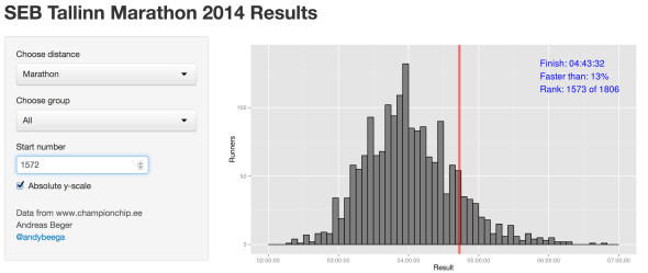
Shiny interactive visualization of SEB Tallinn Marathon finish times. The highlighted time is for me. Yes, I am slow.
The Shiny tutorial is straightforward and easy to follow and it wasn’t that difficult to adapt it. The amount of code required is surprisingly short, mainly 3 files: server.R to handle input and output, ui.R to set up the interface, and a function that does most of the plotting. The complete code is on Github.
The data by the way come from the results section via web scraping. I haven’t done much of this before, but it is surprisingly easy for well-structured html tables:
library(XML)
library(plyr)

km.html <- readLines("http://www.championchip.ee/ftp/liveresults/2014/140914_42km/")
km.doc <- htmlParse(km.html)

km <- readHTMLTable(km.doc, header=T, as.data.frame=F, skip.rows=1)
km <- km[[1]]
km <- data.frame(km, stringsAsFactors=F)

# The last row is blank, we accidentally catch the footer as a row.
km <- km[-nrow(km), ]
km <- km[, -18]
For publishing apps, the tutorial goes through several options, including hosting at shinyapps.io. The latter is free for now, and conveniently integrated in R through the shinyapps library. Once installed, it is stunningly simple:
setwd("path/to/app")

library(shinyapps)
deployApp()
It takes a few seconds to package and upload the app, and that’s it.
The app I created is not very fancy, and to be honest I probably spent more time on the plotting functions and figuring out weird scoping problems than on the interface and actual app-related overhead. But that speaks to how well both shiny and shinyapp are set up, and the quality of the tutorials for both. Like R Markdown and knitr, shiny/shinyapp look like great ways to present and make R code more accessible.