Quick background maps in R
Tags:
#Maps
#R
#Visualization
Sometimes, for whatever reason, you want to plot something fast. Last week I had some coordinates associated with event data that I was hoping were all from Egypt. But the coordinates were for locations that are only indirectly associated with the events I had, so I wanted to do a quick plot to check. The ggmap package in R makes that pretty easy.
First, some libraries we will need, and the coordinates. I put the coordinates in a separate gist in order to have a replicable example, but they originally are the result of a not-so-straightforward SQL query (and hence my desire to verify the location).
library(ggmap)
library(source.gist)

# Get data frame with coordinates for points
source.gist("6705264")
So now we have a data frame with the lat/long coordinates:
> head(egy.points)
Latitude Longitude
1 30.0626 31.2497
2 30.0626 31.2497
3 30.0626 31.2497
4 25.0000 35.0000
5 30.5000 33.7000
6 30.1219 31.4056
At this point, we could plot the coordinates, and maybe add the boundary for Egypt by sourcing from GADM. That would give us a map with the outline of Egypt and the points. Alternatively, ggmap provides a similarly straightforward solution but with a nicer map that includes bodies of water, cities, names, and other things that you would colloquially expect a map to show.
# Get background map
egy.map <- get_map(location=c(lon=30, lat=26), zoom=6, maptype="terrain", filename="~/Desktop/ggmapTemp")
p <- ggmap(egy.map) +
geom_point(data=egy.points, aes(x=Longitude, y=Latitude), col="red", size=5)
p
The get_map() command downloads a map from Google centered on 26N, 30E, the approximate centroid for Egypt, with the zoom set so that we get the entire country. It took some playing around to get the zoom right, but the function also lets you download a map by providing a bounding box, which would make sure we get the right map extent. Anyways, once we have the map we can use the ggmap command along with regular ggplot2-style graphics to add the points to the map and display it. This is the result:
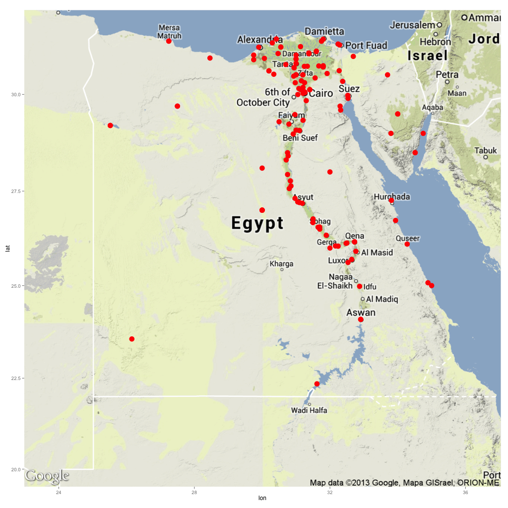
Great, all locations are in fact in Egypt, and seem to be in places where people live. Pretty decent for 7 lines of code (5 if you don’t count the data sourcing). Here is a gist with the code.