Plot of Duke grade inflation
Tags:
#Duke
#Grade Inflation
#R
Someone sent around a link this morning to data on grade inflation at Duke, which shows a table of average GPAs for undergraduates from 1932 on. Looking at the table you can sort of get a sense of when GPA’s really started increasing (the ’60s), but it would be nicer to just plot them:

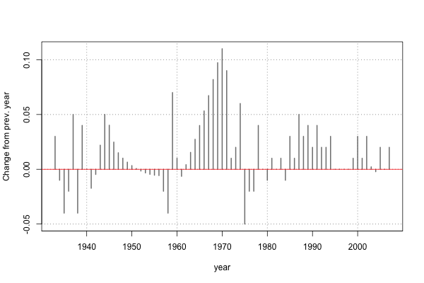
Or to plot the year over year change in average GPA, with some missing values interpolated:
I’ve never tried to scrape a website with R before, but it turns out for this it was pretty easy (with some help).
Using the XML package and readLines() from the base package you can read the html file which has the grade inflation data. The result of this is not really useful yet since it contains all of the original html and xml tags, but with another function, readHTMLTable one can pull out just the table itself. Since R will by default convert character vectors to factors when creating a data frame, there are a few extra lines in the code below to create a data frame with two numeric vectors for year and GPA:
library(XML)
library(plyr)

# Get and format html file
duke.html <- readLines("http://www.gradeinflation.com/Duke.html")
duke.doc <- htmlParse(duke.html)

# Get table as data frame
duke <- readHTMLTable(duke.doc, header=F, as.data.frame=F)
duke <- data.frame(duke, stringsAsFactors=F)
colnames(duke) <- c("year", "gpa")

# Format columns
duke$year <- as.numeric(duke$year)
duke$gpa <- as.numeric(ifelse(duke$gpa=="n.d.", NA, duke$gpa))
So now we have a data frame with correct types for year and GPA:
> head(duke)
  year  gpa
1 1932 2.25
2 1933 2.28
3 1934 2.27
4 1935 2.23
5 1936 2.21
6 1937 2.26
But if you look at the table on the original website, you might notice something funny with the years listed…there are gaps, or missing years, like the skip between ‘47 and ‘56. After a few lines to add the missing years (link to the full code is below), we can plot the average undergrad GPA for Duke from 1932 on:
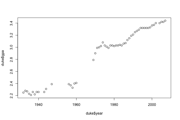
plot(duke$year, duke$gpa)
With a little bit of extra code we can make the plot look a bit nicer: add grid lines, mark every decade instead of every 20 years on the x-axis, axis labels, and set the y-axis limits to round numbers:
par(cex=1.2)
plot(duke$year, duke$gpa, ylim=c(2, 4), type="p", pch=20, xaxt="n",
     xlab="year", ylab="GPA")
x_ticks <- seq(
  round_any(min(years_covered), 10),
  round_any(max(years_covered), 10), 10)
axis(1, at=x_ticks)
grid(col="gray50", lty=3)
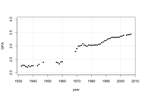
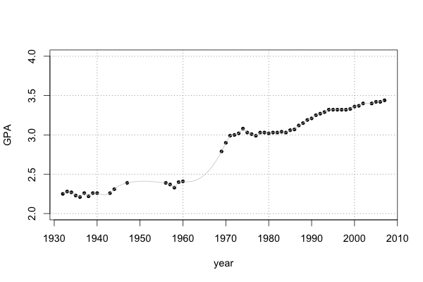
Coding aside, two things stand out from this plot. First, there are significant gaps in the data, e.g. in the 50’s and 60’s. Second, something crazy happened with grade inflation in the 1960’s. We can do something about the missing values by using splines to interpolate them:
duke$gpa_inter <- spline(duke$gpa, n=length(duke$year))$y
lines(duke$year, duke$gpa_inter, col="gray80")
Finally, since in the context of grade inflation we might be less interested in the absolute values for the average GPA, it might make more sense to plot the changes in GPA from year to year. It looks like there was a period of grad inflation in the late ’40s (WW2?) and another, bigger period of grade inflation in the 1960s. This actually seems to have happened nation-wide in the 1960s, if you look at the writeup at http://www.gradeinflation.com/.
plot(duke$year[2:dim(duke)[1]], diff(duke$gpa_inter), col="gray50", pch=20,
     xlab="year", ylab="Change from prev. year", type="h", lwd=2, xaxt="n")
axis(1, at=x_ticks)
grid(col="gray50", lty=3)
abline(h=0, col="red")
Here is a gist of the complete code.